

Aesthetic Archetype: Paola Antonelli
How the MoMA's Paola Antonelli teaches us to see the beauty in traffic cones, shopping carts, and even “ugly” dogs.

My First Aesthetic Epiphany
When I was about ten years old, I received a Panasonic Take-N-Tape recorder for the holidays. It was electric blue, softly rounded at the edges, with stubby buttons that clicked with reassuring authority. The bold color coordinated well with my oft-worn polyester Adidas track suit.
By today’s standards, the device was clunky. Almost cartoonish. But at the time (mid-1970s), it felt impossibly modern.
I still have it.
It wasn’t valuable. It wasn’t rare. And it certainly wasn’t art. But I loved it. Not just because it could play my Shaun Cassidy cassettes or record my voice on a homemade radio show (decades before SiriusXM), but because of how it felt. Long before I had the language to explain it, that object taught me something essential about the power and purpose of aesthetics.


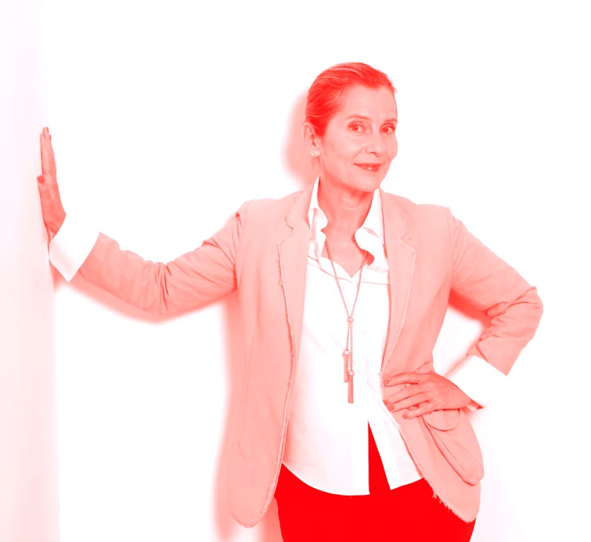
Memories of the Take-N-Tape came flooding back last week during a podcast conversation with Paola Antonelli, Senior Curator in MoMA’s Department of Architecture and Design and Director of the Museum’s Research and Development.
Over the past three decades, Paola has quietly reshaped how the world understands design, bringing everything from video games and emojis to medical devices into the MoMA’s permanent collection. Her exhibitions and books have expanded the definition of “good design,” insisting that cultural relevance, ethics, and empathy matter as much as form.
Her work shows how well-designed objects achieve something traditional art rarely does; they make people feel seen. Museum-goers may revere a Picasso or a Rembrandt from a respectful distance, but when they encounter a familiar object - something they’ve worn, carried, or used - they feel represented.
In a nutshell, Paola has built a career around helping people see meaning in objects that otherwise are overlooked. Objects like jelly beans, traffic cones, shopping carts, and Post-it Notes. She calls them humble masterpieces.
Once you hear her explain why, you can’t unsee them.
Design Is Not Art
People assume that the main difference between art and design is that art is emotional, design is functional. Paola offers a different distinction: “Design implicates other people, by definition.”
In other words, artists can choose whether or not to respond to the needs of others. Designers cannot. Designers must be intentional. And even when their intention is to provoke or amuse, they bear responsibility. To Paola, designers who choose to ignore that responsibility are simply bad designers.
Paola’s insights made me rethink my own respect for the design of objects. What’s important is not whether they’re beautiful in the conventional sense, or whether they’re “serious” enough to belong in a museum. What’s important is whether and how their intentions are achieved?
The Design of Candy
Packaged food is one of the clearest, most relatable examples of strategic design. That’s why Paola speaks about the shape of pasta with the same rigor she brings to the architecture of a building.
Candy seems to have a special place in the laurels of Paola’s top designs. And not because it tastes sweet. As she puts it, “Jellybeans are not interesting because they’re candy; they’re interesting because of their precision, their manufacturing ingenuity, their consistency at scale, and their accessibility.”
The beans are an extraordinary show of industrial control; each one, identical in size, predictable in flavor, engineered to be replicated millions of times without losing its character. What looks playful is, in fact, highly disciplined.


Another fascinating example: M&M’s. They were born in a wartime effort to make treats for soldiers that would “melt in their mouths, not in their hands” (or pockets). M&M’s hard sugar shell wasn’t designed as decoration, but as a solution against the constraints of heat and logistics. This innovation evolved into one of the most recognizable objects in global culture.
For Paola, that’s the point of good design: it tells you precisely what it was made to do and it does it well. With M&M’s, the reliability of its design is part of the pleasure.
And pleasure, Paola insists, is not frivolous; it’s essential. When objects work so seamlessly that their utility is experienced as pure pleasure, that’s design at its best.

Seeing the Extraordinary in the Ordinary
Paola’s book, Humble Masterpieces, advocates for a different kind of attention - one that values the objects we live with every day, not despite their ordinariness, but because of it. She argues that design history isn’t only shaped by iconic chairs or luxury materials, but by things that quietly do their job well, often without being noticed at all.


That’s why Paola is drawn to everyday things, even so-called “ugly” ones.
She doesn’t use the word ugly much herself. What she responds to is personality. Mutts. French bulldogs. A three-legged cat. What she doesn’t respond to is indifference.
“The opposite of beautiful is not ugly,” she said. “It’s lazy.”
Lazy design doesn’t argue with you. It doesn’t provoke or invite engagement. It exists to fill space. And that may be the greatest design failure of our time—not ugliness, but emptiness.
In Humble Masterpieces, she reframes ugliness as evidence of intention. These objects aren’t trying to seduce; they’re trying to serve. And in a culture obsessed with polish, there’s something quietly radical about the concept.


The Museum in Your Drawer
One of my favorite moments in our conversation came when I asked Paola whether she curates her own personal spaces in the same way she curates her exhibits at the MoMA.
Her answer: “absolutely not.”
She’s an accumulator. She keeps obsolete technology, odd ephemera, strange artifacts from past lives. Not because she can’t let go, but because she understands something most of us forget; objects are historical records.
As she said: “You can find a museum’s worth of objects in your drawer.”
And that is precisely how she thinks about design. It’s not about deciding what’s worth noticing.
Consider the traffic cone. Not particularly elegant, but brilliantly designed. It’s visible. Reflective. Portable. Stackable. Forgiving when it’s hit. Recyclable when it’s worn out. It quietly performs a life-saving function without asking for admiration.
Or the shopping cart: structural, mobile, grid-based so nothing sticks to it, hard to steal, stackable horizontally. It’s a piece of everyday architecture so well designed we stop seeing it altogether.


That’s the paradox of good design: when it works well, it disappears.
Paola believes- and I agree - that the art of noticing - or what I call Aesthetic Intelligence - isn’t a gift. It’s a muscle. And you don’t need to live in cultural capitals like New York or Paris to train it. You just need to step outside and observe with care.
Notice what works. Notice what doesn’t. Ask why.
When I asked her what a beautifully designed object in the year 2050 might look like, her answer was simple and striking: fewer objects, invisibly designed. She predicts function will be embedded into us and into our environments.
I’d add this:
I think we’ll look back at this era with disbelief at how overstimulated our visual senses were and how undernourished our other senses became.
I believe if design has a humane future, it will be quieter, more deeply felt, and more embodied.
Practice Better Seeing
We’re taught to believe that meaning lives in the exceptional - luxury goods, rare artworks, perfectly curated lives. The concept of humble masterpieces argues the opposite - meaning is not scarce; it’s abundant. What’s scarce is attention.
You don’t need to buy better things. You need to practice better seeing.
Because once you do, the world reveals itself for what it really is: a gallery of intentions. Some are lazy. Some are violent. Some are joyful. Some are quietly heroic. Every object carries a choice someone made.
To notice that is not aesthetic indulgence; it’s Aesthetic Intelligence. It teaches us to ask better questions, demand better outcomes, and recognize our own agency within the world we move through.
Ultimately, it’s an opportunity to decide not just what kind of objects we want to live with, but what kind of people we want to be.
Cheers, Pauline

This post, and Paola's retention of physical artifacts, made me think about digital artifacts and the very real problem of the artifact overload that defines our digital lives. As a result, many people are working on making sense of that abundance (or burden, depending on how you look at it) and how best to distill it to the most meaningful, highest signal types of artifacts. I do wonder what this will yield in terms of physical distillations, as well. I suspect this will be a new genre of design in the not too distant future - the unwinding or materializing of digitized artifacts into something physically crafted to serve us in some other way. Very interested to see where it goes!
A wonderful post, Pauline. One of the best I've read. Because it's an easily applied concept. With concrete examples from everyday environments, and I thought along on plenty more. Just observed "substantionals". Each attribute conveys a tiny message. And together it's clearer Like cluster gestures in body language. My instinct is also about interacting with my environment. Highly agree future designs will be more modular to make devices invisible like airbag in car crush, and menus get open only when one needs them. We live in an overcommunicated word and our minds simplifies, generalize and distort info all the time. So refraining from being overwhelmed is crucial.
Find it interesting that people feel represented by some objects. With identification in action people are more engaged with the activity. However, that might become addictive and compulsive which has moral aspects to it. Dopamine triggers can be dangerous for attention and distractions are a big problem. That's why filters become more and more common and basic.
For Take-N-Tape recorder example I'd add it's rounded edges make it more pleasant to carry in one's palms, that is highly sensitive area people use daily plus it also slips nicely into pocket to avoid the embarrassment of struggling awkwardly (that is a concern for young teens who want to look cool yet need to get used to changes of their bodies). However most people won't use it in snowy areas with gloves so intentional design and our current ability to manipulate materials make it so we have to switch gears. In future smart devices will adjust by default in shape unless we set them to stay... just like with smartphone camera sensors switching landscape & portrait modes.
it's wise to simulate the end user's situation and consider what's important for them to make their experience one that evokes positive feelings. In high school I had 2 speakers I used to carry inside my hoodie's with MP3 player. One was rounded and small with great bass, the other was clunky foldable gadget with square edges. I loved both for different attributes, but the retro one more as It had less planned obsolescence in its design. For me I despise it when a piece of tech has its "too smart engineering" like the cable socket makes it inevitable have issues and also the lithium battery vs. the AAA changeable ones made me prefer the retro version. Like if I interact with tech and I properly maintain it I expect it to work indefinitely or at least for years. However most manufacturers have a different business model that creates much waste. Another big factor is it must be easy to deal with as the tool/piece of whatever is always a means to an emotional "end", we shall always remember this with tools and devices.